Mando, H2Care
Hydrogen Refueling Service Platform
An app and responsive web platform that helps hydrogen vehicle users find charging stations and check key service information.

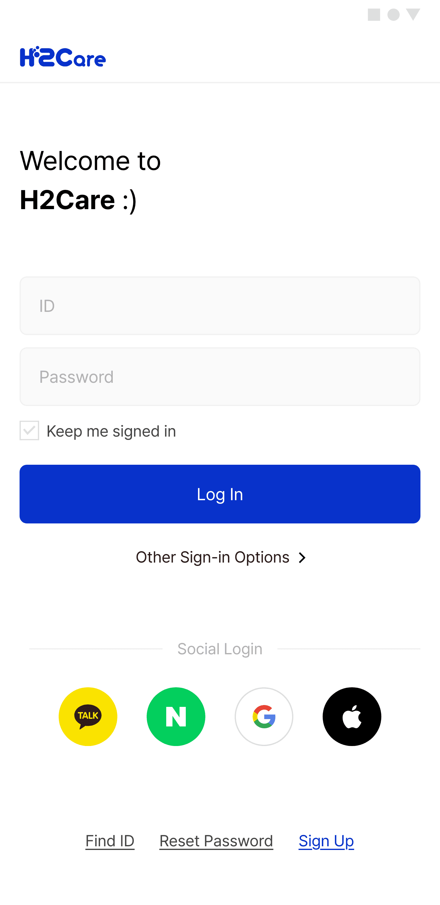
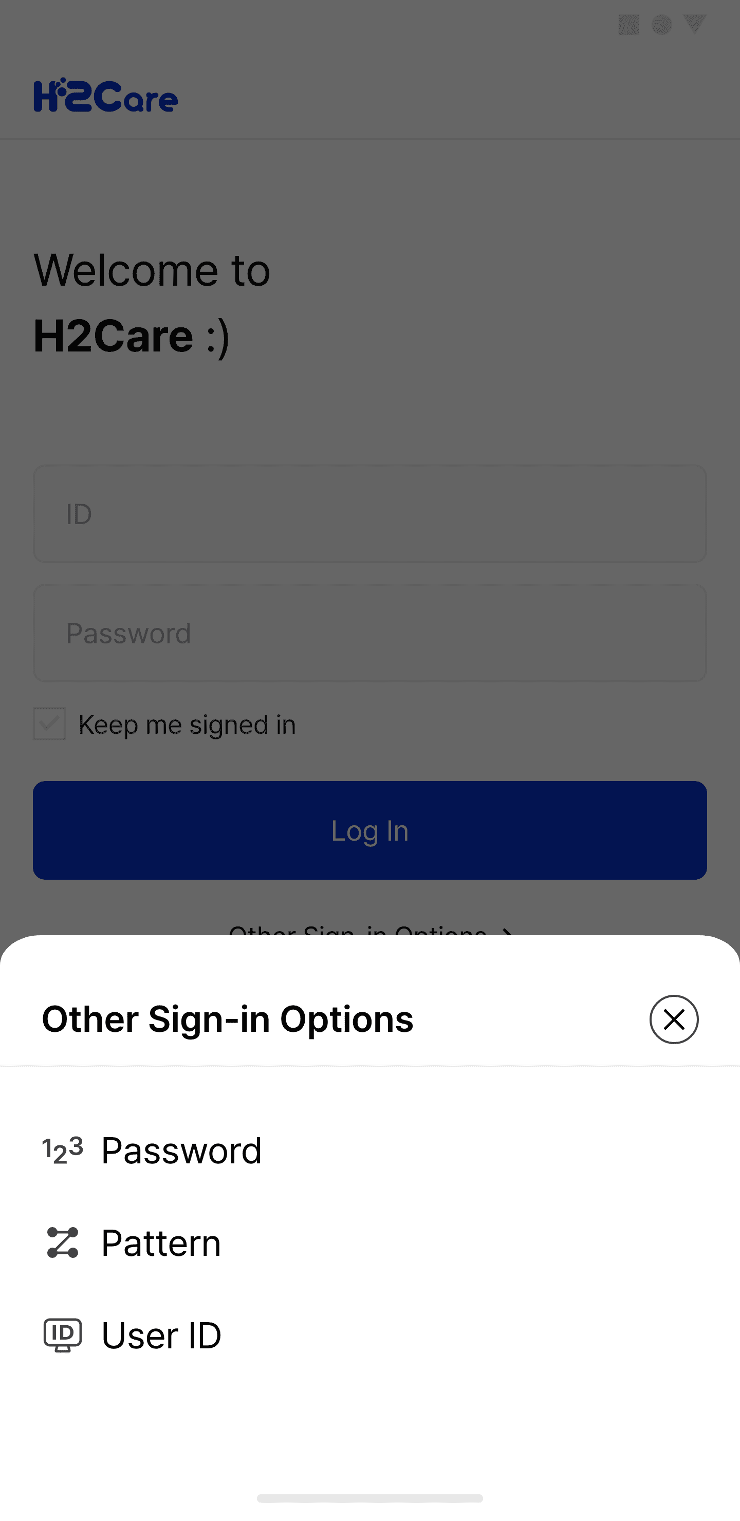
Mando H2Care is designed to support the refueling journey across mobile, tablet, and desktop environments. The design focused on making station information, service status, and reservation guidance clear and easy to access.
Duration
January 2022 ~ June 2022
Role
Product Designer
(UX Architecture, Terminology Design, UI Design)
Contribution
Designed app and responsive web interfaces for a hydrogen refueling service platform.
Structured user flows for station search, service status checking, reservation guidance, and refueling-related information.
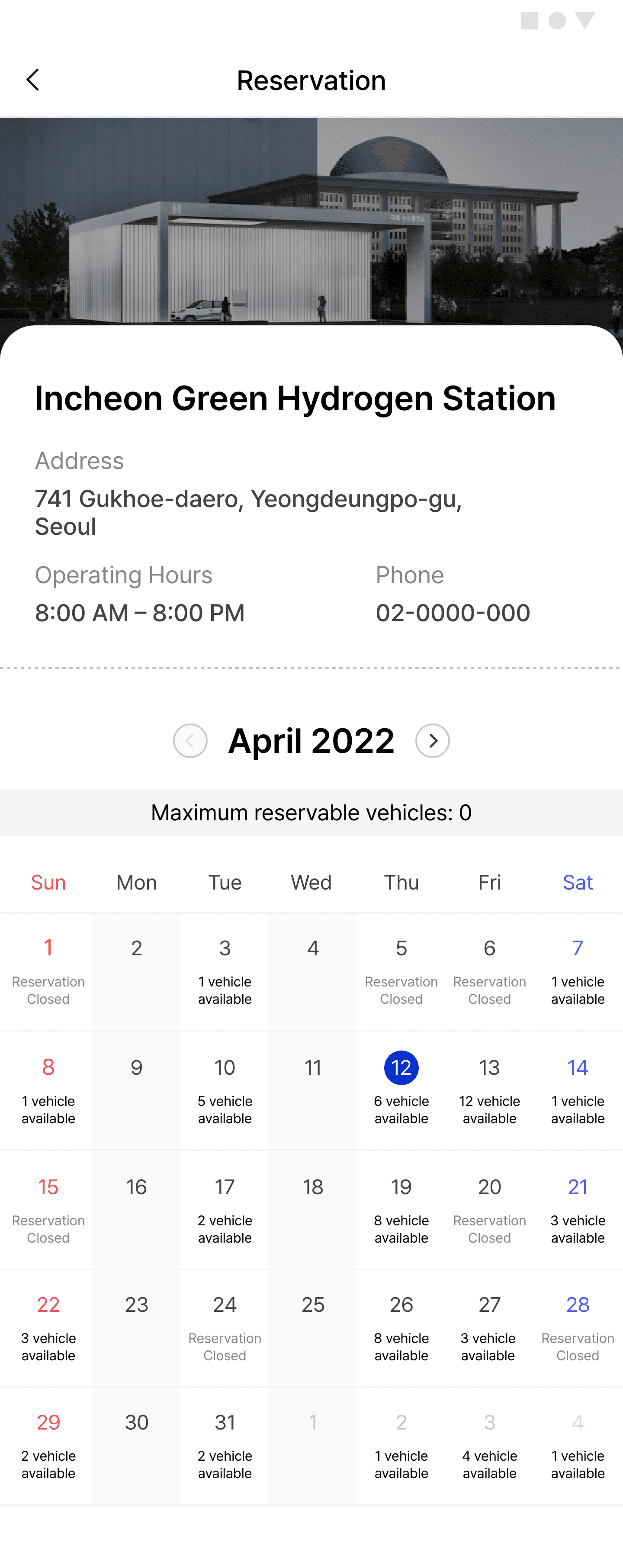
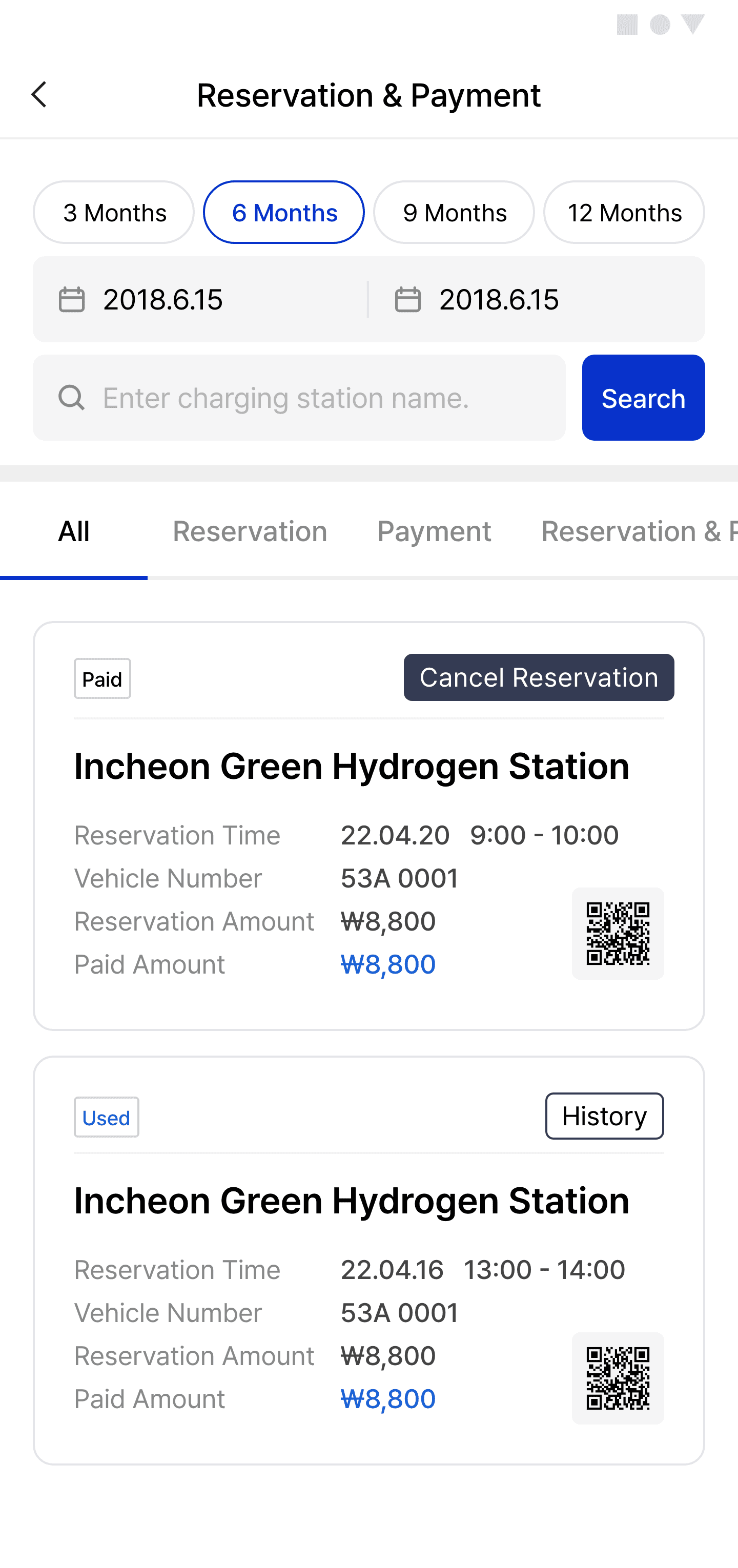
Designed reservation information screens to help users understand time, station details, status, and next steps.
Adapted layouts and UI components for mobile, tablet, and desktop screen sizes.
Organized key information and actions to support a clearer refueling experience.
Overview
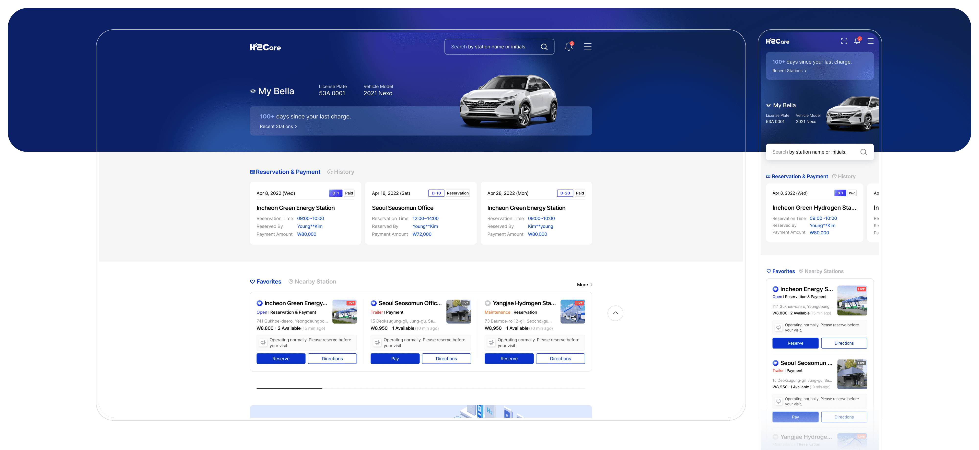
Mando H2Care is an app and responsive web service for hydrogen refueling.
It helps users find stations, check status, and review reservation details.
The design focused on clear information delivery across mobile, tablet, and desktop.
Problem
Users need to check multiple details before visiting a hydrogen station.
Unclear information can make station selection and next steps feel uncertain.
Station lists and station details needed a clearer information structure.
Service status and reservation information needed to be separated and easy to scan.
Users needed clearer guidance after checking station or reservation details.
The same task flow needed to remain consistent across app and responsive web.
The core challenge
Helping users make refueling decisions with less uncertainty across app and responsive web experiences.
Goal
Help hydrogen vehicle users plan their refueling journey more clearly and confidently.
Design-wise, the goal was to support decision-making from station discovery to reservation confirmation across different devices.

UX Review & Design Considerations
Since formal user research data was not available, I reviewed the service structure, key screens, and refueling-related flows from a UX perspective.
The review focused on how users move from finding a station to checking status, understanding reservation information, and taking the next step.
The core challenge
Information hierarchy between station list, station details, and reservation guidance
Clear distinction between service status, availability, and reservation details
Placement of key actions after users check important information
Responsive layout consistency across mobile, tablet, and desktop environments
Key direction
The design direction was to position H2Care as a practical refueling support tool, not just a station information service.
Design Strategy
Help users quickly understand station conditions and take the next step.
Connect station information, service status, and reservation guidance into one clear flow.
Design Principles
01
Surface decision-critical information
Prioritize information users need before visiting a station, such as location, status, availability, reservation time, and station details.
02
Guide users to the next step
Place actions and guidance where users naturally need them, so they can move from checking information to taking action without confusion.
03
Keep the experience consistent across screens
Use responsive layouts and reusable UI patterns to maintain a stable experience across mobile, tablet, and desktop environments.







Color System
#0933CD
#0933CD
#C8D4E3
#9FADBE
#333C55
Aa
Pretendard
Bold
SemiBold
Medium
Regular


